November 30, 2021
The Port of Seattle was the first port authority in the country to establish an Office of Equity, Diversity, and Inclusion, with the goal of embedding these values into the fabric of the organization. The Port will realize this goal by working to become a truly equitable and anti-racist organization.
One important tool to help progress towards this vision is the Port’s Equity Index. It’s an interactive and data-driven map that displays a visual representation of social and environmental disparities in King County. Using 21 indicators within four categories, the Equity Index illustrates the degree to which different communities experience pollution burdens and social inequities. Across the region, there are significant variations in pollution exposure, access to economic opportunities, and the overall standard of living.
The index was created by the Port of Seattle’s Office of Equity, Diversity, and Inclusion as a tool for the Port to understand those variations that exist within the region and use that information to direct resources towards the areas of greatest need. Port staff uses the Equity Index to equitably guide funding decisions and broadly inform policy decisions across the Port. It’s a mapping tool that will identify opportunities to help communities and leverage limited resources; the data will be used to help advance equity in our region.
The equity index will help the Port:
- Better understand the communities surrounding Port operations as far as pollution, access to services, and their overall standard of living
- Guide funding activities
- Direct resources and programming for those in need
- Dismantle barriers for historically oppressed populations
- Give communities the resources they need and want to thrive
What influences health and wellbeing?
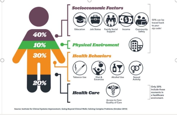
According to the Institute for Clinical Systems Improvement in the image below, almost 50% of the factors influencing your wellbeing can be traced back to your zip code, which is why a tool like the Equity Index is so important. The Equity Index allows the user to access data and see patterns on a near granular level, viewing data by census blocks at the smallest level. This will allow both the Port, other governments, and community-based organizations to create programs and interventions based upon data to address the specific needs of different communities. And, it will help policymakers and community groups determine how to focus these efforts. For instance, do we need to improve the physical environment, are there issues accessing healthcare, or does a community need access to family wage careers?
What is the equity index?
We all use indexes in our everyday lives to get through the world happy and healthy. Indexes combine multiple data sources and attribute an easily understood score to the aggregated data. For example,
- The BMI Index measures your weight, height, and body mass and create a plan for healthy living
- The wind chill index measures wind and temperature and helps you decide which jacket to put on when you’re heading out the door
- The Big Mac Index shows the value of this McDonald’s sandwich in different countries and the relationships of currencies around the world
- The U.S. News and World Report colleges index
- The Port of Seattle’s Equity Index combines multiple datapoints on the ground sources of lifestyle data for communities in our region. And positions these communities and datapoints relative to each other.
What is an equity datapoint?
One of the first steps to building this tool was collecting accurate and timely data. Every piece of data in the system is supported by at least four peer-reviewed papers that associate that datapoint with equity.
Data is collected from regional partners and jurisdictions, rather than relying wholly on census data. The Port is expanding partnerships with partners in the region. To partner, contact the Office of Equity, Diversity, and Inclusion.
The Port of Seattle has created a GIS shape file and a user-friendly website where analysts at government institutions or members of the community can access the data.
How is this equity index different?
Data is aggregated by Census block, with a racial demographic overlay so users can examine the correlation between race and resources in each community.
It contains four categories aligned with the Port’s Century Agenda, which is the organization’s strategic North Star. The tool is aligned with the Port’s mission and relevant to our region.
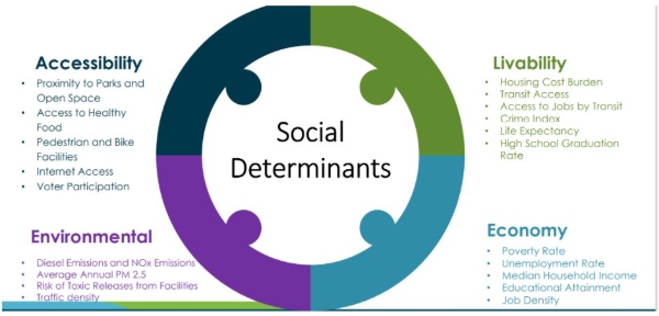
The equity index has four categories and 21 indicators that are all social determinants of health and wellness. Here are examples of just a few indicators.
Accessibility
- Do you have access to parks, healthy foods, and biking or walking infrastructure?
Economy
- Can you get a living wage job?
- Do you get to participate or benefit from the economic growth of the region?
Environment
- Is your community healthy and safe?
Livability
- What’s your standard of living compared to others in the region?
- Is the community that you live in safe and healthy?
- Do you have access to housing ownership?
- Do you have access to public transit?
Where does your community fall in relation to others?
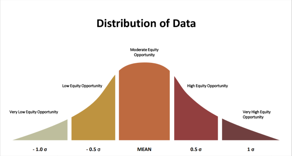
The data is distributed into Quantiles (five parts) to show the opportunities relative to other communities in the region. This distribution is useful in answering the questions:
Does this community have access to the opportunity to succeed or excel in life? How does it compare to other communities in the region?
What’s the data distribution in this community and how many data points are you from that mean?
Who can use this tool?
The Port’s Equity Index tool provides analysis that communities and staff in public service can use in work to plan their day to day initiatives. There are two ways to access this data for different stakeholder audiences
- As a GIS shape file for ARC GIS users with layer information (for the analyst audience)
- A user friendly website (for members of the community)
How do I use the Port’s Equity Index?
The interactive map includes six demographic different layers that can be turned on (or off) to evaluate the degree for each community of:
- People of color
- Equity index
- Economic index
- Livability Index
- Accessibility index
- Environmental index
It also offers index values for economy, livability, accessibility, and environment values, plus an overview that can be applied to each geographic area.
Practical applications
How can this data and mapping tool be used to aid decision making and foster equity?
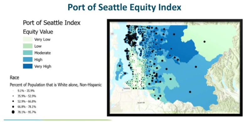
This map shows the distribution of opportunities in communities with an overlay of resident demographics.
- Dark blue areas represent economic opportunity
- Black dots (ranging from large to small) represent white non-Hispanic people living in that community. Small black dots represent low concentration of people of color; large dots mean higher concentrations of white residents.
This map demonstrates that the areas with the highest opportunities (darker blues) also have lower concentrations of people of color.
Other practical applications of this tool include:
Policy decision making
For example, placing noise monitors in communities with less access to opportunity to measure the amount of noise as compared to communities with more opportunities
Public works
This tool could show utilities or governments where to place information in the communities that need it most when they have limited budgets. These datapoints could be used to find the communities with the most traffic, the highest accident rate, and needing safe schools
Health
One potential application during COVID-19 could be to discover the most vulnerable communities that were most impacted by the pandemic and place vaccination sites there.
Participatory budgeting
How can governments identify communities with the lowest input and participation and get them involved?
What’s next for the Equity Index?
1. Create case studies
demonstrating the application of the tool to answer specific questions
2. Collect more data
including an overlay with people who speak English as a second language
The map will be updated yearly, and the Port will work with communities to define attributes and aggregate data. The Port will redistribute and reaggregate data for particular cities. The Port can provide King County data and make it relative to just the data for your city or town.
Building more partnerships with University of Washington, City of Seattle, and King County). The Port is working with other local jurisdictions to discovery what they are doing with equity and data. And the Port is making investments in communities by creating storymaps, video, and photos.
3. Create story maps
Story maps are an interactive, web-based Arc GIS map integrated with photos, captions, video, time specific data, popups, and other interactive features that help users explore a particular topic.
4. Define other applications for the tool
In the future, we’ll bring you more case studies detailing applications of the Equity Index in the Port’s work and in other jurisdictions in the region.
Resources
- Read more about the Port’s Equity Index
- Watch the recording of the webinar
- Read the Equity Index FAQs
Subscribe to Equity in Action newsletter for more stories like this